Color Experts Farrow & Ball Create 4 Key Color Trends for 2010
I just received the run down on the 2010 color trends from Farrow & Ball. They are all fresh and exciting combinations. I like the earthy shades in the Industrial color trends palette. The subtle, natural colors in the Aquatic color trends palette would be dreamy in a bedroom. I especially like the dark and dramatic colors in the Urban Decay color trends palette (Pitch Black No.256 is one of my all time favourite accent colors). And how can you top the Glitz & Glamour color trends palette for adding a bit of pizzazz to a room. I would stick with the neutrals for the largest areas (Cat's Paw No.240, Savage Ground No.213,Ringwold Ground No.208) and use the brighter accent colors sparingly, maybe incorporating them in artwork and accessories.
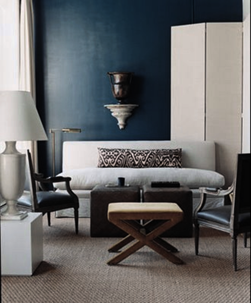
1. Industrial 2010 Color Trends: A strong but fragile fusion of colour.
Inspired by industrial architecture, this look is all about modernity mixed with tradition. Old and new are combined in an urban palette of muted tones that mimic the earthy shades of natural materials such as stone, clay, chalk and brick. Team soft grey based neutrals such as Cornforth White No.228 and Pavilion Gray No.242 with intense and inky darks such as Off-Black No.57 and Down Pipe No.26 to create a contemporary scheme. The deep, dramatic hues are accented and uplifted by splashes of vibrant, zestful colour with citrus shades such as Babouche No.223 or Orangery No.70.

2010 Color Trends
Key colours for the Farrow & Ball Industrial 2010 Color Trends :
Farrow & Ball Down Pipe No.26
Farrow & Ball Off-Black No.57
Farrow & Ball Pavilion Gray No.242
Farrow & Ball Cornforth White No.228
Farrow & Ball Setting Plaster No.231
Farrow & Ball Orangery No.70
Farrow & Ball Babouche No.223
Farrow & Ball Blackened No.2011
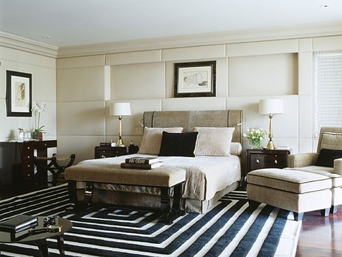
2. Aquatic 2010 Color Trends: A soft, watery palette defined by the elements.
This is a gentle, tranquil scheme. Subtle, natural colours are starkly contrasted with strong inky blues and combined with the reflective qualities of light, glass and mirrors for a diluted, watery look featuring freshwater tones. Try Strong White No.2001 or James White No.2010 teamed with the soft Pavilion Blue No.252 or Tunsgate Green No.250, and underpinned by Blue Ground No.210, Drawing Room Blue No.253 or Hague Blue No.30.

2010 Color Trends
Key colours for the Farrow & Ball Aquatic 2010 Color Trends:
Farrow & Ball Pavilion Blue No.252
Farrow & Ball Tunsgate Green No.250
Farrow & Ball Blue Ground No.210

Farrow & Ball James White No.2010
Farrow & Ball Hague Blue No.30
Farrow & Ball Strong White No.2001
Farrow & Ball Drawing Room Blue No.253
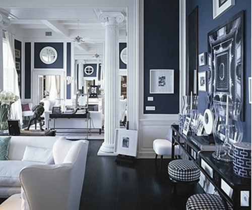
3. Urban Decay 2010 Color Trends: A vibrant scheme with an unpredictable twist.
Bold and graphic, this look is heavily influenced by the global economic meltdown and features the strong use of vibrant colours, but with an urban edge. Team dark and dramatic colours such as Pelt No.254 and Pitch Black No.256 together in a scheme for a theatrical look and experiment with paint finish as well as colour to make a real statement. Use Eco Full Gloss to create a high shine surface and inject with zingy, bright colours such as Arsenic No.214 and Dayroom Yellow No.233 for added impact and the ultimate visual scheme!

2010 Color Trends
Key colours for the Farrow & Ball Urban Decay 2010 Color Trends :
Farrow & Ball Pelt No.254
Farrow & Ball Pitch Black No.256
Farrow & Ball Oval Room Blue® No.85
Farrow & Ball Parma Gray® No.27
Farrow & Ball Dayroom Yellow No.233
Farrow & Ball Arsenic No.214
Farrow & Ball Great White No.2006
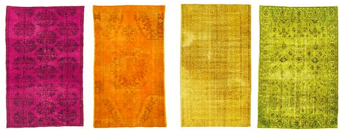
4. Glitz & Glamour 2010 Color Trends: A decadent look that celebrates excess.
In complete contrast to Urban Decay, this look is all about wealth and indulgence. Use rich and opulent shades like Brinjal No.222, Pitch Blue No.220 and Churlish Green No.251, alongside shimmering gold and metallics for an extravagant feel. This glamorous, glitzy look has a Middle Eastern influence, so colours include exotic shades which combine and collide in a celebration of colour and excess. Try Porphyry Pink No.49, Brinjal No.222 and Churlish Green No.251; a riot of colour with an adventurous twist. Key to this look is the myriad of colours – definitely not for the faint-hearted!

2010 Color Trends
Key colours for the Farrow & Ball Glitz & Glamour 2010 Color Trends :
Farrow & Ball Brinjal No.222
Farrow & Ball Cat's Paw No.240
Farrow & Ball Churlish Green No.251
Farrow & Ball Savage Ground No.213
Farrow & Ball Pitch Blue No.220
Farrow & Ball Porphyry Pink No.49
Farrow & Ball Cinder Rose No.246
Farrow & Ball Ringwold Ground No.208
What is your favourite 2010 Color Trends palette?
Please let me know by leaving a comment [here].
Patricia Gray is an award winning Interior Designer in Vancouver, British Columbia, Canada who blogs about
"WHAT'S HOT" in the world of Interior Design: New and Emerging Trends, Contemporary Design, Modern Architecture and Travel,
as well as how your surroundings can enhance the world around you.
© Patricia Gray | Interior Design Blog™ 2009
